Vision Statement
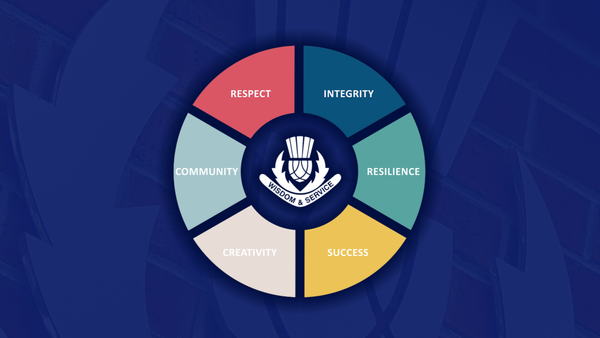
McKinnon Secondary College lives by its motto ‘Wisdom and Service’.
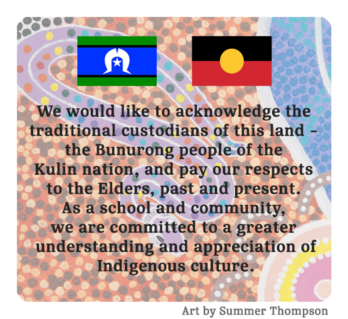
We foster a love of learning and respect for diversity. We strive to nurture empathetic, creative and confident young people who are connected to our community and Indigenous heritage. We want our students to embrace opportunities for continuous improvement and accept the challenges of a complex and globalised world.

Great Vic Bike Ride - Seeking Sponsorship
McKinnon SC has been involved in the Great Victorian Bike Ride for over 30 years, traveling thousands of kilometres across Victoria, giving back to hundreds of regional communities and creating lasting memories for our students, staff and families. This year, Team MCK are seeking new sponsorship as we prepare to take on the 350km, 5-day event, cycling in The Goldfields from Bendigo to Creswick, between Monday 23 November - Friday 27 November in beautiful Dja Dja Wurrung and Taungurung Country. Last year, Team MCK experienced the strongest participation rates since Covid19, cycling from Mortlake to Camperdown in Eastern Maar Country with 90 students. Our goal for 2026 is to take 100 Years 8 and 9 students on this quest! Your support will help close the expense gap and enable these hopeful students to tackle the challenge ahead. We are reaching out to potential Sponsors earlier this year. This will ensure more time is spent promoting your business within our local community during information sessions, school publications and training rides. This year, we are offering three sponsorship packages; Gold, Silver and Bronze, as outlined below. GOLD ($500 and over):Team MCK Cycling JerseyMcKinnon Instagram pageMcKinnon GVBR Banner McKinnon School Newsletter SILVER ($250-500):McKinnon Instagram pageMcKinnon GVBR Banner McKinnon School Newsletter BRONZE (Up to $250):McKinnon GVBR Banner McKinnon School Newsletter To start the 2026 promotion material, including jersey design, a simple indication of which package you would like and a high-resolution image of your company logo is all we need; payment details will be provided by the school's finance team at a later date. We are grateful for any and all support. If you have any questions, please do not hesitate to contact us. Paul KingGVBR Coordinator
We Are Hiring!
Opportunities are now available to join McKinnon Secondary College, a premier school with an outstanding team and culture. Apply via School Jobs Vic (formerly Recruitment Online) using the Job ID. Economics/Commerce TeacherFull time, OngoingCommencing 13/7/2026Job ID: 1527359Apply by 27/5/2026 Visual Arts Teacher (Years 7-12)Full time, OngoingCommencing 13/7/2026Job ID: 1526251Apply by 18/5/26 Enquiries can be directed to Marie Landini, Personnel Manager via lm@mckinnonsc.vic.edu.au or on 8520 9057.
Vision and Values
McKinnon Secondary College fosters a life-long love of learning. We celebrate Australia's diversity and indigenous heritage. We nurture excellence and empathy in our students as global citizens, ready to participate and be leaders in a complex world. Our students are confident and creative individuals with a strong sense of community and social responsibility. For more information on Vision and Values click here. OUR VALUES

Dr Justin Coulson Parent Evening
On Wednesday 25 March, we were delighted to welcome Dr Justin Coulson to McKinnon Secondary College for a parent evening, with almost 400 members of our community in attendance. It was a wonderful opportunity to come together and reflect on how we support young people to build resilience and character. As a community, we also reflected on what resilience really looks like in practice, particularly in those moments when it feels hardest to access, and how this connects to our wellbeing framework and our core value of resilience. Justin spoke about the importance of helping young people not just reach the “mountain top,” but to learn to navigate and even appreciate the climb, reminding us that growth often comes through challenge. He reinforced that resilience is deeply relational and grounded in strong values and character, and that it often doesn’t feel like resilience when we are in the middle of it. His message that there is no triumph without trial resonated strongly, encouraging us to stay alongside our young people as they navigate the complexities of growing up. We thank our parent community for their strong attendance and support of the evening. Patty EtcellHead of Wellbeing

House Music Festival
This year's annual House Music Festival was held on Wednesday night, and what an amazing show of talent it was. The collaboration, energy and high standards enthralled the audience - well done to everyone involved, you should be very proud. Congratulations to Monash whose name will join the long tradition of winners on the House Music shields displayed in the Music Centre at the main campus. Thank you to Mr Ed Fairlie, our adjudicator, for his time and fair evaluation - I’m sure it was not easy to declare only one winner. I also thank and acknowledge Ms Leah Humphrey who coordinated this wonderful event as well as our dedicated team of music teachers and staff who made this possible. I also thank and acknowledge Ms Leah Humphrey who coordinated this wonderful event as well as our dedicated team of music teachers and staff who made this possible. Michael KanPrincipal
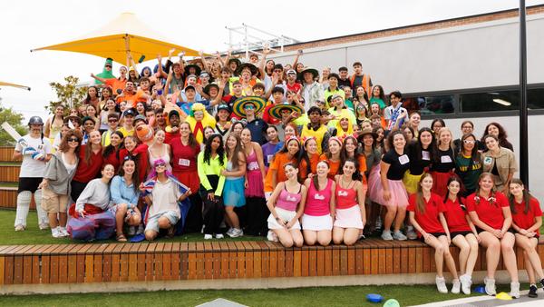
Swimming Carnival
Our annual School Swimming Carnival was held on Wednesday 25 February and was a fantastic success, with students and staff enjoying a wonderful day of competition and fun. We were incredibly lucky with the weather, which held out beautifully and provided perfect conditions for a full day of swimming and diving events and cheering from the sidelines. The positive atmosphere around the pool was a highlight, with students proudly dressed in this year’s theme, "Aussie! Aussie! Aussie!" and showing outstanding encouragement and sportsmanship throughout the day. The level of competition was impressive, with students giving their best in every race. A remarkable eleven new records were set across the day! An outstanding achievement and a true reflection of the talent and determination of our swimmers. Congratulations to all students who competed and especially to those who have progressed through to the Kingston Division Swimming Competition. After a closely contested carnival, Monash emerged victorious and were proudly awarded the 2026 Swimming Carnival Trophy. Well done to the Monash House Captains and students! A big thank you to all staff, especially the PE staff for assisting with the organisation and running of the day. Ms Hungerford Swimming Carnival Coordinator
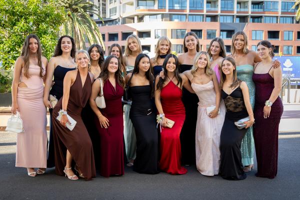
Years 11 & 12 Formal
The Rupert Clarke Grandstand at Caulfield Racecourse was transformed into a sea of glamour and high fashion last night as nearly 900 McKinnon students gathered for the much-anticipated Years 11/12 Formal. Held in the elegant Promenade Room on Level 2, the evening was a spectacular celebration of our senior school community. From 7:00 pm to 10:00 pm, the room was buzzing with energy. This year’s cocktail-style event allowed students to mingle freely, catching up with friends across both year levels, making new friends across the cohorts, all the while enjoying a delicious variety of finger food served throughout the night. The atmosphere was electric from the moment the first track dropped. Between strikes of a pose at the photo booths and the non-stop action on the dance floor, the sense of camaraderie was palpable. It was a wonderful opportunity for our seniors to take a well-deserved break from their studies, dress to the nines, and create memories to last. A huge thank you to the staff who attended and the Year 11 and 12 student management teams who made such a large-scale event run so seamlessly. It was truly a night where our senior students shone! Kate JobsonHead of Years 11 & 12 A NIGHT TO REMEMBERFormal was a night to remember! We had a great experience at the Caulfield Racecourse venue, being the first year of McKinnon students having the formal there. Even though everyone was a bit hesitant about the joint Years 11 and 12 formal, it ended up being an amazing time and a great inter year level bonding experience. It was so exciting to see everyone dressed to the nines in their fancy dresses and suits. The DJ was pumping great tunes and everyone had fun on the dance floor. We are so grateful to all the teachers and Caulfield staff who helped organise the amazing night for us. Allegra & CharlieYear 12 students

Presentation Night 2025
The final formal occasion of 2025 was our Presentation Night, celebrating outstanding student achievement across music, sport, the arts and academic pursuits. A special congratulations to our College Dux, Siena Nott, who achieved an exceptional ATAR of 99.70. Siena also earned a perfect study score of 50 in Chemistry. Thank you to our special guests who presented awards, and to the staff who helped organise and ensure the smooth running of the event, as well as the many families and staff who attended. It was a wonderful celebration of our community. Well done to all McKinnon students recognised on the night. Your hard work and dedication are truly inspiring. You can view the photo gallery here

VCE Results 2025
I am proud to share with you the outstanding VCE results for the Class of 2025. These exceptional outcomes are a true reflection of the dedication and hard work of our talented students. 123 students received an ATAR above 90227 students (55%) received an ATAR above 809 perfect study scoresMedian Study score: 33Study scores over 40: 12.5% Well done to all of our VCE students on your achievements! I would also like to acknowledge the wonderful teachers, support staff, and parents who have worked closely with and supported the Class of 2025. Michael KanPrincipal

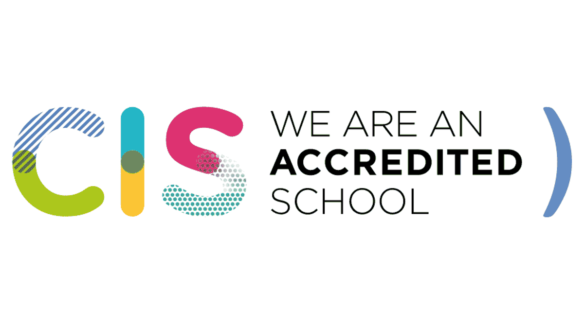
Council of International Schools Re-accreditation
I am very proud to announce that McKinnon Secondary College has officially received re-accreditation from the Council of International Schools. This milestone is a testament to our school's commitment to high-quality international education and the journey of continuous improvement. This was a significant undertaking, and I would like to thank everyone involved, particularly Mr Phillip O’Brien, who led the process. Well done on this incredible achievement. Michael KanPrincipal
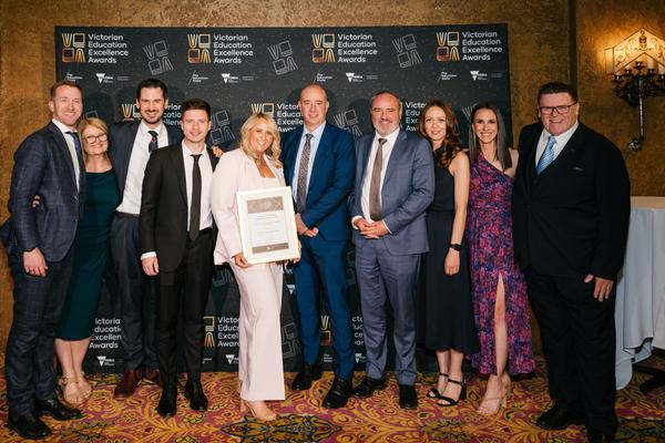
Victorian Education Excellence Award Finalists
We are incredibly proud to share that our Student Wellbeing Team were named finalists in the 2025 Victorian Education Excellence Awards for the second consecutive year. The Outstanding Education Support Team Award recognises education support teams across Victoria that demonstrate exceptional collaboration, innovation, and a strong impact on student learning and wellbeing. This recognition not only celebrates the vital work our team does each day to support students, staff, and families, but also acknowledges significant initiatives such as the McK Respect Project, our Wellbeing Vision, Framework & Strategic Design, and the delivery of Teen Mental Health First Aid to over 120 staff and 550 students. Although we did not take home the award this year, being recognised among the state’s most dedicated educators was a moment of great pride. We congratulate our Student Wellbeing Team on this achievement and thank them for the profound and lasting impact they continue to make within our school community.